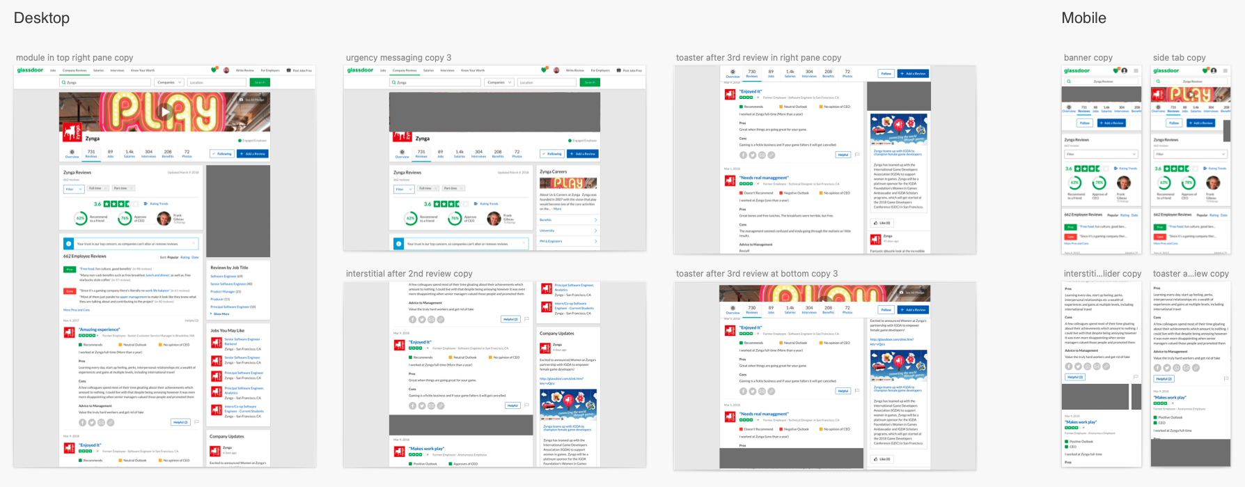
Glassdoor is a website where people can review and rate companies, search for jobs, and see what their salary range should be in their profession.
Jobs to Content
Problem: Users coming from Google aren’t discovering relevant jobs on our content pages in both signed-in and signed-out states. Users coming from signed-out state account for 85% of our users. Additionally, users aren’t filtering their search for us to provide them with better results. Validating data tells us that 36% of users do not know they can use Glassdoor to search for and apply to jobs.
Solution: Provide a one-stop-shop experience for the user by offering the right job at the right time, and completing their tasks of researching and applying in one place.
UX Challenge: Promote more jobs, while keeping the focus on the user’s primary task. Capture the same job they are looking at on Google Jobs, and provide better a better filtering experience.
Research: Before putting pixels together, we asked a series of questions to real candidates looking for a job. Would a user who came to Glassdoor to look at reviews, apply to a job after seeing on on the same page? Why would the user want to apply elsewhere? If you decide you like the job, when would you apply?
My Part: Designed the end-to-end experience from research and usability testing to prototyping, working with PM and Engineers.
Step 1: User test existing flow
To better understand the problem, we had 15 users go through the experience to find pain points.
Step 2: Apply qualitative results to inform designs
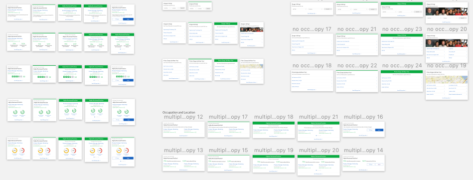
Of the 15 users we tested, 80% of them didn’t know where to search for jobs on Glassdoor, so i mapped out different touch points to see which one is the most discoverable.
…Most users also preferred searching for a job by location, so I iterated on different patterns.
Step 3: Final deliverable
After narrowing down options from internal design reviews and user testing, i delivered a way for users to search by location that was intuitive and discoverable.
Jobs Page Redesign
Problem: When I joined the Jobs team, the jobs page was a 3-pane grid, consisting of Filter, SERP, and Job Details that was performing poorly. The side-rail filter was the biggest problem, not just with it’s complicated functionality on desktop, but it performed terribly on mobile.
Internal Challenges: The PM liked to work in a silo, so there was little communication and collaboration through the lifecycle of this product. Ultimately, the product failed because no other team had any insight, until it was rolled out.
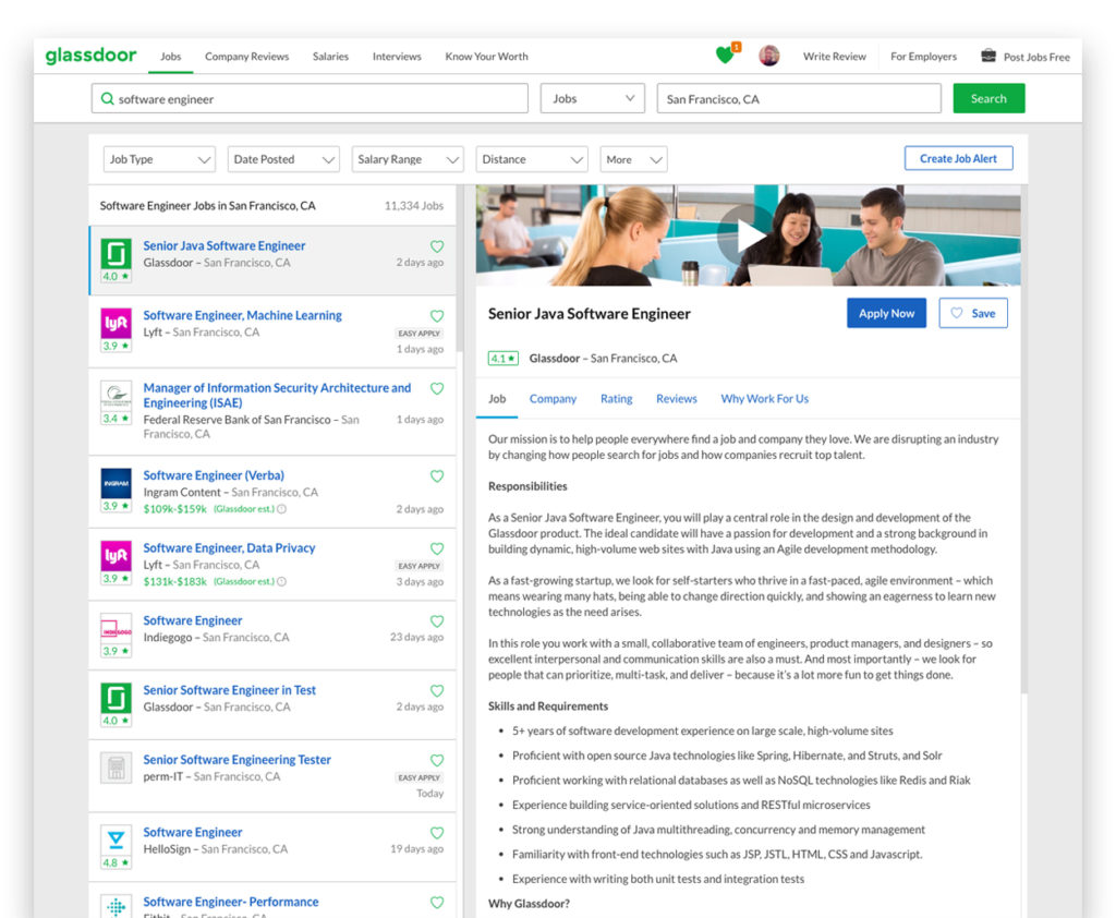
Solution: Create a filter system that integrates naturally with the SERP and Search bar, for a more focused and intuitive experience on desktop and mobile. Create an inclusive environment where other stakeholders have early insights to the progress from the beginning.
My Part: Designed the end to end experience from wireframes and prototyping to research and usability testing. I worked closely with PM, Engineers. and other stakeholders.
Step 1: Audit existing Jobs page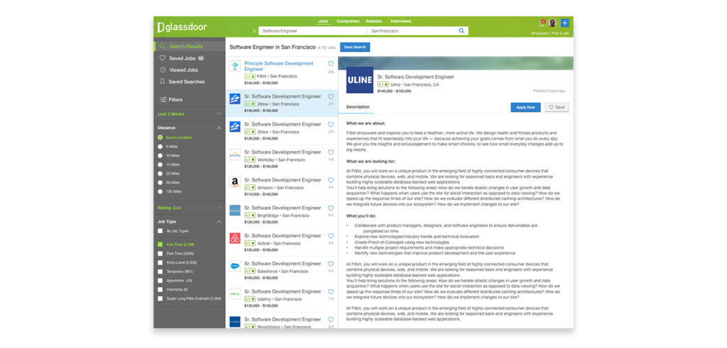
Step 2: Lead usability testing
Designed many concepts to user test.
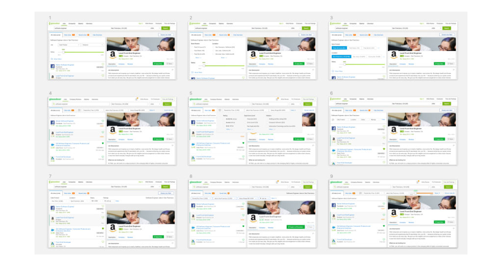
Step 3: Final deliverable
After narrowing down options from internal design reviews and user testing, we rolled out this new jobs page, which increased engagement by 25%
…mobile as well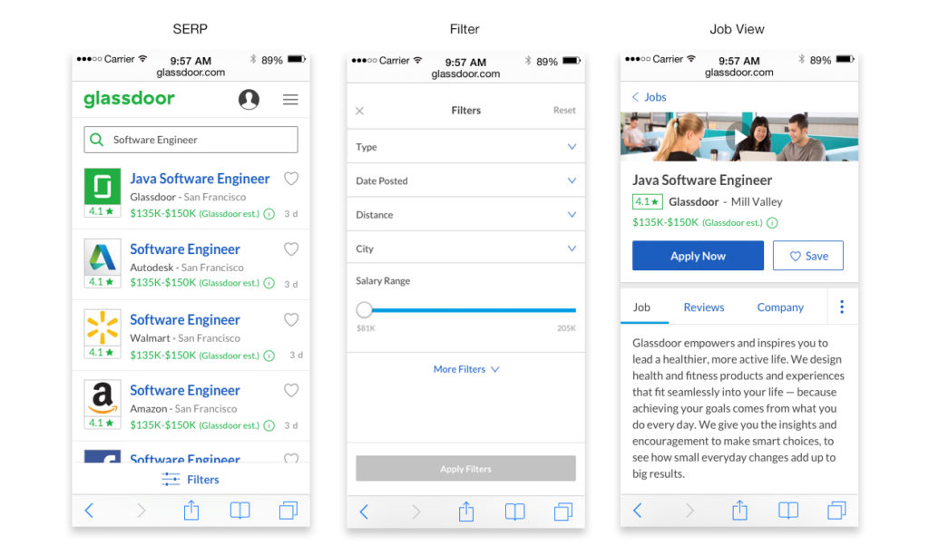
Job Application Status Tool
User Problem: Users can’t track where their status is on Glassdoor, once they apply for a job. From Applied to Accepted an Offer, there are many stages through the applicant lifecycle that a candidate needs to manage.
Business Problem: 80% of users apply offsite, so there is no way of tracking whether they actually finished the apply process.
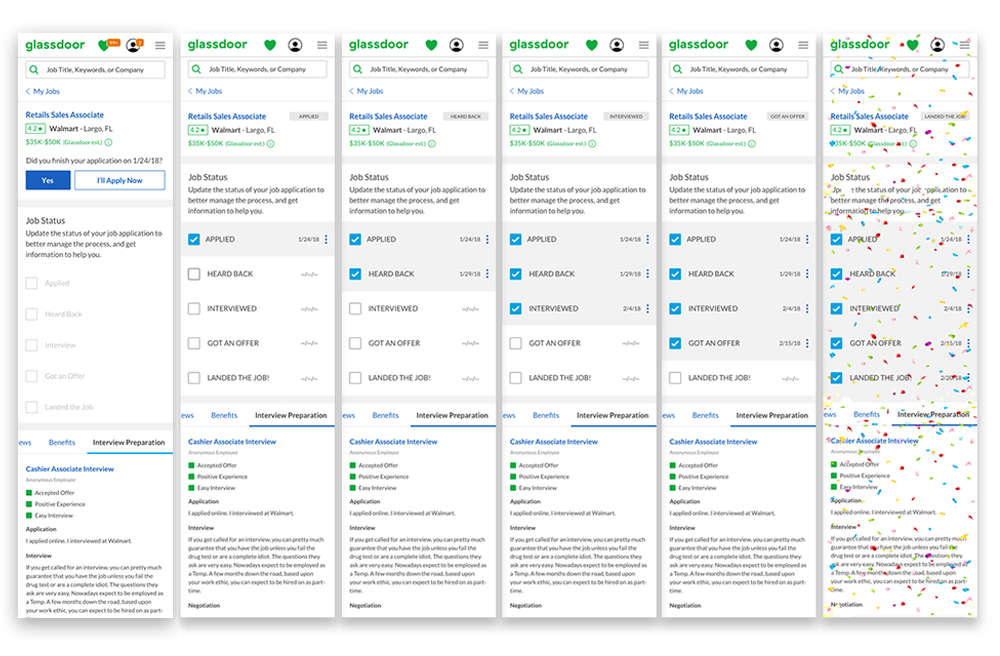
Solution: Create a tracking tool that helps users manage the status of multiple job applications from Applied to Accepted an Offer, and get useful information through each stage, while providing Glassdoor with valuable UGC and confirmation that the user completed their application.
My Part: Designed the end to end experience from research and user flows to wireframes, prototyping, and usability testing. This was a new product that hadn’t been developed before, so i worked very closely with Engineers to insure all requirements were possible.
Step 1: Iterate on the user flow from the requirements.

Step 2: explore different interactions, to find the most intuitive experience.

Step 3: Final deliverable
After narrowing down options from internal design reviews and user testing, we rolled out this new jobs page, which increased engagement by 25%
…desktop too.
20% Projects
- Created an Epic in Jira for all of the designer to document any UI issues they see, and assign them to Engineers.
- Future Job Search Exploration
- Percent Match Score Exploration
- Created a UX slide deck that designers could use to present their projects to stakeholders and peers, with focus on the UX process.
- Mentored Designer on best ways to work with PMs that don’t take design recommendations.
- Created a repository for competitive analysis, categorized by Org, that helped with design efficiency.
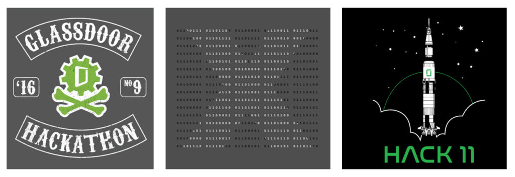
…0h, and I designed their Hackathon shwag too.


